Over the past few years, furniture color trends have gone through a noticeable shift—moving from safe, neutral palettes to more expressive, personality-driven choices. Today’s consumers are no longer just decorating a space—they’re curating an environment that reflects mood, lifestyle, and individuality.
From Cool Neutrals to Warm, Grounded Tones
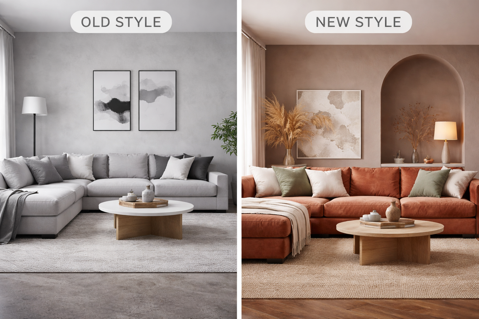
A couple of years ago, cool grays, stark whites, and monochromatic palettes dominated the furniture industry. These tones were largely influenced by minimalism and modern design trends, creating clean but sometimes sterile environments.
Today, we’re seeing a strong pivot toward warmer, earth-inspired tones. Colors like:
- Terracotta
- Camel and tan
- Olive green
- Warm taupe
These shades bring a sense of comfort and calm, aligning with consumers’ desire for cozier, more inviting living spaces. This shift reflects a broader trend toward wellness and “home as a retreat.”
The Rise of Bold, Statement Colors
While neutrals still play a role, there’s been a clear increase in bold accent pieces. Deep, saturated hues are making a comeback, including:
- Navy blue
- Forest green
- Burgundy
- Mustard yellow
In previous years, these colors were used sparingly. Now, they’re showing up in larger furniture pieces like sofas, sectionals, and accent chairs. Customers are becoming more confident in using color to define their space rather than just complement it.
Nature-Inspired Palettes Take Center Stage
Another major shift is the influence of nature. Organic color schemes have become increasingly popular, blending greens, browns, soft blues, and sandy neutrals.
This trend ties closely to:
- Sustainability awareness
- Biophilic design (bringing the outdoors inside)
- A desire for calming, grounded interiors
Compared to the cooler, industrial tones of past years, today’s palettes feel more relaxed and connected to the natural world.
Soft Pastels Are Making a Subtle Comeback
Pastels have re-emerged, but in a more muted and sophisticated way than before. Instead of bright or playful tones, we’re seeing:
- Dusty rose
- Sage green
- Powder blue
- Soft lavender
These colors work well in both modern and transitional spaces, offering a gentle pop of color without overwhelming the room.
Mixing Materials and Colors
Another change from previous years is how colors are being used alongside materials. Rather than uniform finishes, we’re seeing more:
- Mixed wood tones
- Contrasting upholstery and frames
- Layered textures with complementary colors
This creates more depth and visual interest, moving away from the “match everything” approach that was common in the past.
What This Means for Retailers and Consumers
For furniture retailers, these evolving trends highlight the importance of offering variety and helping customers visualize how color fits into their homes. For consumers, it opens the door to more creativity and personalization.
The biggest takeaway?
Furniture color is no longer just a background choice—it’s becoming the focal point of design.